6 Elements to Use in Mobile Design
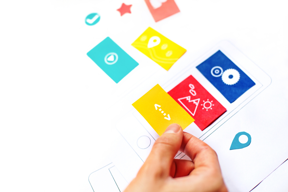
Designing for mobile devices requires reimagining ergonomics, touch mechanics, and content prioritization. Incorporate these six elements to create intuitive smartphone experiences.
The Ergonomics of Mobile Browsing
Unlike desktop users who interact via precise mouse pointers, mobile users navigate primarily with one thumb while on the move. Modern mobile design must cater directly to natural thumb reach zones and smaller viewport constraints.
6 Key Elements for Mobile Success
- Thumb-Zone Navigation: Place critical navigation buttons, search triggers, and action buttons in the bottom two-thirds of the screen where thumbs can reach effortlessly without hand gymnastics.
- Off-Canvas Drawer Menus: Clean slide-out hamburger navigation drawers keep headers uncluttered while providing organized access to secondary pages.
- Finger-Friendly Tap Targets: Ensure interactive elements have a minimum clickable area of 44x44 pixels with ample spacing to avoid frustrating mis-clicks.
- Optimized Mobile Input Forms: Trigger the appropriate virtual keyboard (e.g., numeric keypad for telephone numbers, email keyboard with @ symbol) and enable browser autofill.
- Sticky Header or Sticky CTAs: Keep your phone number or 'Get a Quote' button fixed at the top or bottom of the screen so users can convert at any scroll point.
- Fast Responsive Media: Serve correctly sized images using srcset attributes so mobile devices don't download multi-megabyte desktop banners.
Respecting the User's Bandwidth and Time
Mobile users are frequently on cellular connections. Eliminating decorative bloat and delivering instant clarity creates friction-free conversions.